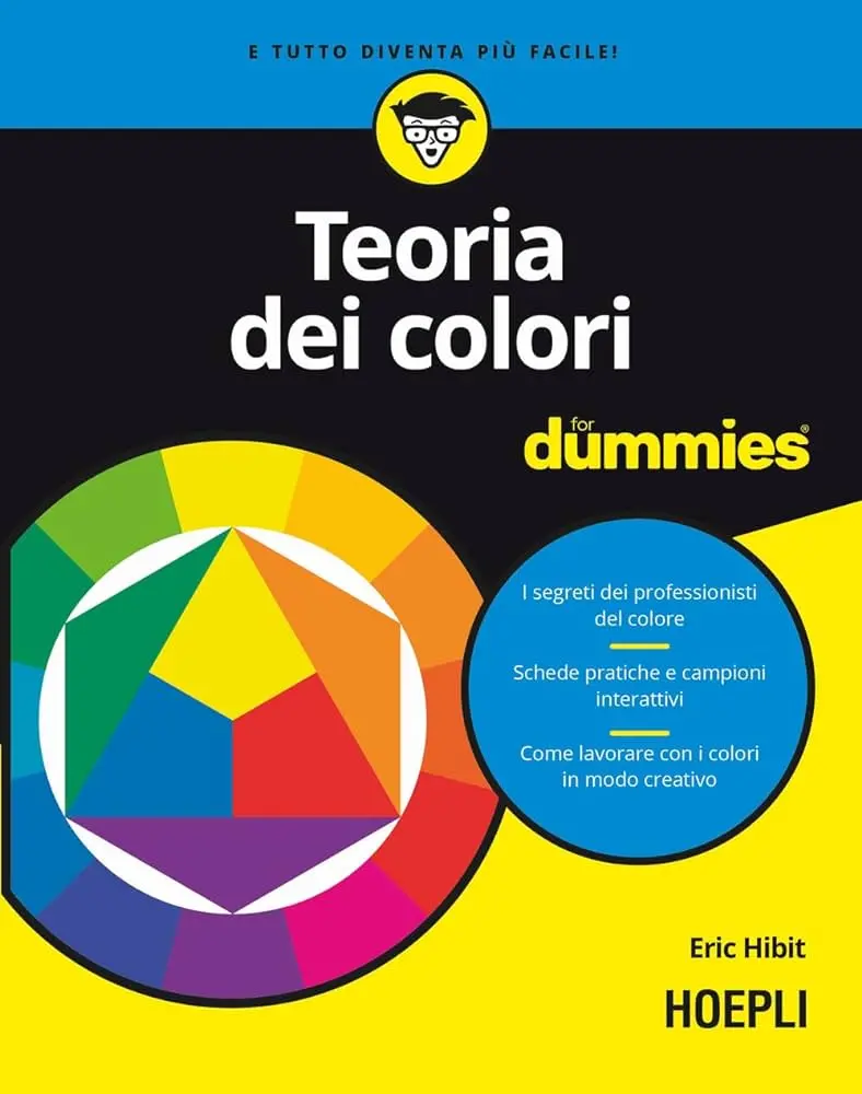
All the ways of the rainbow
In Eric Hibit's book how to use color combinations to excite, relax, inspire and convey different meanings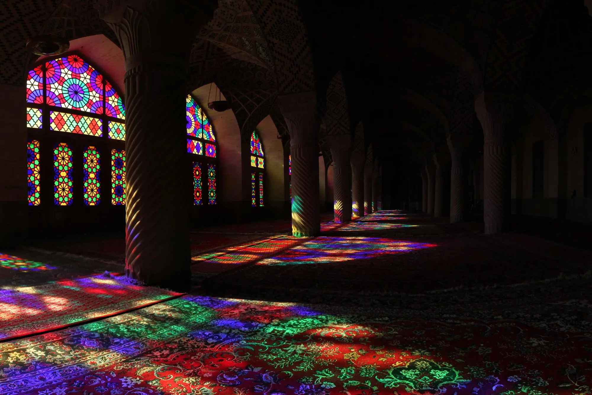
Per restare aggiornato entra nel nostro canale Whatsapp
From prehistoric rock paintings, still dazzling today, to the new trends in chromotherapy, human beings have been and are seduced by the infinite chromatic varieties that surround us. Colors fascinate us, they make us change our mood for better or worse. Worn, they tell us. So why not get to know them better? The volume “Color Theory” (Hoepli Editore, Euro 29.90, pp. 288) presents the study of colors in art and design to allow them to be used in the most effective way, in everyday life as well as in work.
The book, written by the American visual artist Eric Hibit, illustrates the color wheel, contrasts and chromatic contexts in a simple and practical way. It tells us the long history of color. A story that is a novel, even just focusing on the use of colors in art. Let's think about it: before the second half of the nineteenth century, when the first chemical pigments (i.e. coloring substances) began to be produced, colors were obtained only from organic materials: minerals, particular types of stones, plants and even animals such as insects and clams. These were raw materials that were difficult to work with, often coming from the most remote corners of the known world and therefore very expensive. A color widely used in painting was red. The pigment most requested by high-ranking clients was vermilion, made with cinnabar (mercury sulphate) which was extracted in Spain and on Mount Amiata (Siena). Also used for red was kermes lacquer (or crimson lacquer) obtained from an insect, the vermilion kermes. It is a small animal that can secrete an intense red liquid, but to produce one kilogram of dye, 80 to 100 thousand insects were needed! The processing was therefore complex and affected the price, as was the case with the red pigment derived from cochineal, a plant parasite. The good time for collecting this insect was the two weeks between June and July and if the harvest was poor the price of cochineal skyrocketed. Another red dye was extracted from the root of pernambuco, a plant that before the discovery of the New World was found only on the island of Ceylon (India).
By far the most precious and sought-after color in Western art until modern times was ultramarine blue (used for the Madonna's cloak), obtained from lapis lazuli, an ornamental stone that mainly came from modern-day Afghanistan. It was an expensive and rare pigment, which was often replaced with blue produced with azurite, a derivative of copper present in Europe, less expensive than lapis lazuli but certainly not cheap.
Gold was also used in painting, in the form of very thin plates (leaves) obtained from coins, which usually contained the purest metal. Gold was also used in powdered form. To lower prices, silver could be used mixed with a yellow pigment such as saffron (which was still the most expensive spice of all). Saffron was always used for yellow just as orpiment, i.e. lead antimony, a very poisonous substance, was used for yellow. Less noble was the origin of the green which was obtained from verdigris, copper acetate. It was inexpensive but tended to deteriorate other pigments with which it was combined. For this reason, greenery was sometimes produced with ramno berries (a Nordic plant) or using iris juice. These few hints are enough to understand how there is a whole universe around colors that Hibit's volume helps us discover. Because, in addition to the history and techniques, the book explains how to use color combinations to excite, relax, inspire and convey different meanings, but also how to paint an image and improve one's sensitivity to chromatic exposure, for example by learning to appreciate a rainbow in a more natural and complete way. An all-round work, which allows the reader to make effective use of color in their work (design, communication) and to fully enjoy works of art of all kinds, be they paintings, photographs, films, set designs.